Introducing Sports HAI’s New Look
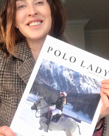
Since starting Sports Hai in 2016 and launching our first products in 2019, Sports HAI’s understated, classic and luxurious packaging has served us well. Looking effortlessly chic in makeup and kit bags alike and printed proudly on the glossy pages of national publications. The makeup itself has been put through the ultimate endurance test, with products making their way out to the fields, courts, pitches, pools and training gyms of some seriously tough athletes and with that, we have learnt even more about our customer; who they are, how they think, the demands of their busy lifestyles and the performance they need from the makeup they wear.
The more we learned about the diverse individuals who swear by Sports HAI, it became apparent that our packaging and brand needed to mirror the bold and daring individuality of our customer, our teammates.
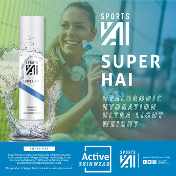
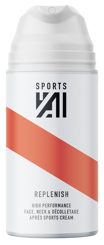
Housing the same, high quality, tried-and-tested products, we have replaced the classic black gloss packaging with reflective finish with contrasting matte metallic vinyl silk screen panels. To reflect our powerful, diverse and unafraid customer, flashes of our striking new colour palette feature throughout the product range. More on that below.
Letting the new packaging and brand colours take centre stage, we’ve re-designed the Sports HAI logo to a compact, geometric icon, shifting the emphasis to the word ‘HAI’ and thus reducing the amount of text on the products themselves. Our new logo features subtly in black vinyl silk screen on all products.
Brand colours, in keeping with the brand messaging and meaning of HAI, we introduce our new colour palette. A deep pillar box red, commanding attention and striking passion. Our true blue denotes independence and is a nod to Sports HAI’s unrivalled waterproofing properties whilst displaying professionalism and sophistication. Yellow catches attention, promotes positivity, resilience and speed. Our scorching orange sparks fire in your belly and is used to celebrate extroversion. And finally our nod to outstanding quality and simplistic elegance, we chose a midnight black for brand accents.
Brand messaging, Summarising our customer is easy and our brand messaging remains the same as it always has done. When summarising into words, we think the list below totally nails it and our new brand assets, logo, colour palette and packaging marry the brand story together seamlessly. We hope you agree!
Thank you Jon Easton and Frederick Tam at Hudson Wright Easton
Unstoppable, Holistic, Sharp, Urban, Functional, Active,
Modern, Uncompromising, Energetic
We’d love to know what you think.